What design can teach us
- 16 Apr 2023
- slides
In a previous life I worked for a bit as a designer. I did some graphic design, but my main interest was always interaction design: not so much what things should look like, but how they should function. Which items should you display on the homepage of a website, what should the structure of the menu be, and so.
I left that work behind a long time ago, but it taught me a few important lessons that I still apply every day in my academic life. You might expect that these lessons have to do with building websites, or choosing the layouts for my slides. But they run much deeper than that. They help me run meetings, give feedback and organize courses.
If you’ve never worked with designers before, you’ll be forgiven for thinking of them as a kind of house painters: somebody else builds the house, and they make it look good. It’s an understandable mistake, but it’s also the surest way to piss a designer off. Design is not about how the house looks: it’s about the how and why of the house. If you want to make a designer happy, you don’t give them a finished product to polish up, you put them in the room from day one of the project.
The reason is that every design decision brings you back to the fundamentals. If you want to design a good product, whether it’s a website, or a piece of software, or a research paper, every decision you make about how it should work, how it fits together, is a design decision.
To see what design really looks like in practice, and what lessons we can take from it as academics, let’s start by looking at the structure of a design process.
The process
The first thing a designer will warn you against is what’s called the waterfall model. It’s a name for the idea of a design process that looks like this: first you write a list of requirements, things your product should do, then you make a design for how it’s going to do those things, then the programmers implement the design, verify that it’s doing what the requirements specified, and then your users start using it and you do maintenance to make sure it keeps running.
That’s waterfall: you plan your process in little blocks, and you start the next block when the previous block is finished.
Waterfall is, as far as I’m concerned, the main reason that all computer and software products were awful throughout the eighties and nineties. It’s falling at the first hurdle of product development. The reason is that you can’t write down your requirements in one go. They’ll be nonsense. You need to figure out what your application needs to do as you build it.
This won’t be news to anybody who has done any software development. It’s a message that was new and radical about 25 years ago. But academia has no problem with being 25 years behind the times in matters like these. So we’ll start with the basics. We don’t do waterfall.
The alternative is usually captured by the umbrella term agile development. There are many flavors with detailed prescriptions that we don’t need to go into. The key idea is that you don’t design your product in one flash of imagination and then build it, like Mozart writing down the music he heard fully composed in his head. Instead, you build up a concept. Something rough and easy to discard. Like a painter working from a rough sketch to a detailed drawing, to blocking out the light in broad shapes, to finally putting on the highlights.
Why is this not waterfall? Because at every step the painter allows herself to go back. Perhaps to the previous step, perhaps to the very beginning. The idea of concepts is to allow yourself to go back to the drawing board when you discover a problem.
This can be nerve-wracking, especially for project managers. With the mindset of waterfall, when you’re at the third stage out of five, you know that you’re halfway. So if you’ve spent half the money, and half the time, you’re perfectly on schedule. The problem is that if a problem crops up with the requirements, you can’t allow your programmers to go back and fix it. So you push on. Your your users get a crappy product, and your developers become miserable because nobody likes building crappy products.
The key to working agile is to allow yourself to go back when you find a problem. Moreover to expect to find problems. Once you’ve accepted that problems will be there, and they will send you back to the drawing board, the game changes. Your goal is no longer to build the perfect thing in one go, terrified all the while that there might be some hidden problem that will force you to start over. The goal is to build something quick and crappy, a prototype: something that will expose the problems with your thinking so that you catch them early, before you’ve invested so much time and energy into building the thing that you can’t bear to chuck it out.
In some areas of academia, this is already how most of us work. When we do experiments, at least in computer science and AI, we start with small-scale proofs-of-concept, and slowly build up.
But not always. How often have you made a slidedeck by starting at the first slide, and moving forward one-by-one, essentially finishing each before starting the next? Have you ever tried sketching out a few different approaches on some scrap paper before moving to the computer to make your slides in detail? Have you ever given yourself 30 minutes to think about the reason why you’re making slides? To consider alternatives like using the whiteboard, or prerecording a video?
How many project proposals have you seen with perfect Gantt charts of exactly what was going to happen in year one, and how you were going to build on that in year two? And how often had the entire idea of the project changed six months after the starting date?
In all of these areas, design thinking can inspire us. To look at it in more detail, let’s walk through the different stages of a typical design process.
To keep things simple, we’ll break our process up in three phases. Ideation, where we decide the details of what we’re going to build and how. Prototyping, where we build increasingly detailed versions of our product, and finishing, where we put the final touches on.
Ideation
Ideation is where you begin. You’re in a room with a bunch of your collaborators, and you know you’re going to make a thing together, but you have made no decisions yet about how to approach the problem.
This is where design starts. What’s more, it’s make-or-break. You can make mistakes in this part of the process that no amount of design prowess will ever allow you to fix. The most important design tools are the ones you apply here.
To make things concrete, let’s say you’re part of the organisation of a large conference and the job of this group is to design and build the conference website. What’s the first question you need to answer?
When left to their own devices, people will usually gravitate towards questions like What should the website be built in? or Where should it be hosted? Do we use Wordpress, or Github pages? Do we build it ourselves, pay a professional, or just take some theme off the shelf?
Then, two or three people propose solutions, and start arguing for them. These are usually the most confident, and the loudest people in the group. What’s worse, is that each of them will identify with their chosen solution. This is some kind of strange human defect: once you’ve proposed a solution and argued in its favor, it becomes yours. Maybe you’re mature enough to let go of it eventually, but even when you do, it will feel like a defeat.
Why is this? Why can’t we just naturally explore the set of all possible options together and dicuss their pros and cons dispassionately? I don’t know. What I do know, is that there are tools that can bring us closer to this platonic ideal. These are the most important tools in design: not Figma or Photoshop but simple tricks that help you structure a discussion.
Let’s start with the most important one.
Asking questions in the right order
The first thing our group of conference organizers did wrong was to start with the wrong question. Eventually, you’ll need to figure out where you’ll host your website, but not before you figure out a bunch of other things. More importantly, you need to agree on all those other things and really make sure that you all agree on them.
So, what’s the main question? What’s the first thing you should always ask? For my money, it’s this:
- Who is this for?
- What do they want?
These are simple questions, and it may seem childish to ask them explicitly, but a clear picture of who you’re actually building for and what you want to help them achieve is the first step in avoiding those nasty shouting matches. The trick to make this useful is to answer them in detail.
For instance, who is this conference website for? Well, people who might want to visit the conference, duh. Ok, but what do they want? Well, that depends. When they’re thinking about whether to submit a paper, they’ll want to know what the submission deadline is.
Let’s start there. Ask anybody (in computer science) to think of the last time they looked at a conference website, and what they were looking for. In my experience about 80% will say they were looking for the submission date.
Now go to any conference website, and see how many times you need to click to find the submission date. If you’re lucky, there is a menu item called “dates” which will show it in one click, albeit nestled among many other dates. If you’re unlucky, you’ll need to hunt around, and you’ll eventually find it at the bottom of a long list of submission instructions.
But if it’s so important, why still one click in the best circumstances? Why isn’t it on the front page? Why is there a news item telling me that the website is now online, but not a little table telling me whether this conference has a deadline I can make?
Why do we build websites where the bit of information that is most crucial to 80% of visitors is hidden three clicks deep at the bottom of a page? I don’t think it’s cruelty or laziness. It’s just that most of us aren’t trained to take the perspective of the user when we build something. Design thinking is nothing more than a set of tools to help you, and the rest of your collaborators, do just that.
Ok, so academics make crappy websites. Maybe that’s one of those things we just learn to live with, like doctors having poor handwriting or trains being late. Maybe that’s not worth a blog post. And it’s not the point of this one. The point is not how to tell you to make better websites, it’s how to make better anything.
Let’s say you have to give a lecture on statistics. What’s the first question you ask yourself? Whether to use Keynote or Google slides? Whether to use bold notation for vectors? A designer will tell us that the first question is Who is it for? and the second question is What do they want? Who are your students? What do they already know? What can you build on? Then, what do they want? Why do they come to your lecture? Because they feel obliged to? If that’s the case, you’d better snap them out of that attitude, and show them what they can do once they master statistics. If they already want to learn statistics, because it’ll let them do thing X, then you need to figure out what X is, and work from there.
Let’s have another example. Should your research group have a reading club? This is the sort of thing that is easily done for the wrong reasons (for instance, because all groups have reading clubs). A reading club that is poorly organized can drain people’s time and energy and cost much more than it’s worth. So who’s it for? Just the PhD students, or everybody? Why would they want to go to a reading club? We all struggle to keep up with the literature, so it should be an easy win. And yet, every obligatory reading club that I’ve ever attended has felt as lively as a wake.
How to make reading clubs work is a topic for another blog post. For now, I just want to make the point that you should ask who you’re doing it for and what they want, before you ask who’s going to organize it, how to bound the topic, and how you’re going to enforce the attendence.
User stories: or how to stop arguing solutions
Building up a clear picture of who your user is and what they want, can take a long time. In professional design settings, it’s a process that can require exhaustive research and evaluation. If you’re not building the next iPhone, however, talking it through for 15 minutes can get you most of the way there.
The main thing that takes time is not so much coming up with a picture of your users—or usally a few different types of users—but making sure that everybody in the team has the same picture in their head. The reason that this is important is that this picture will form the basis of most of your decisions going forward. It will inform your choices.
For instance, what should we put on the front page: a news feed, or the important dates? Well, let’s think about the users, and what they want. The dates, we’ve already established, are an important reason for a user to visit your site. What about the news feed. Can you really think of a realistic scenario in which a user visits a conference website to see if there’s been any news? There may be a few, but this should then inform which items to put in the news feed.
Once you start thinking of these examples, a user coming to your site with a particular aim, you can write them down. This is called a user story. A little description of a particular user and what they want to do. People usually write them according to the template:
As a [user of a particular type] I want to do [a thing] so that [a result].
You don’t have to follow this pattern, you can be a bit more free and easy with it. But the main rule is that you don’t write down how your product is going to solve the user’s need. You just answer the first two questions: who the user is and what they want to do.
I love user stories. I think they’re amazing, and if used correctly they have the potential to change the world. I wish they were taught in high school. If I had to choose whether calculus or user stories were taught in high school I’d prefer them to teach user stories (and I really need my students to know calculus).
Why am I so in love with this simple little trick? Because it solves the main trap that people fall into when they collaborate on anything. The trap that is behind all design by committee, and perhaps behind all organizational dysfunction: arguing over solutions.
Let me give you a simple example.
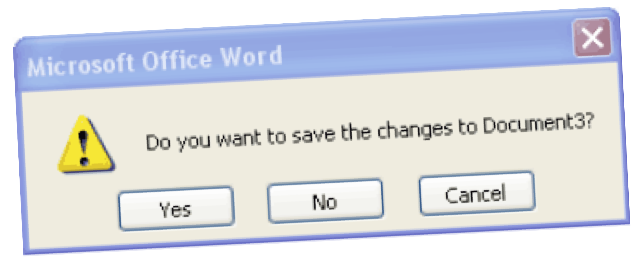
A design team is creating a document editor. The client demands that before the user closes the editor, a dialog appears, asking the user to save their documents. The designer disagrees: confirmation dialogs are bad practice. For various reasons, they don’t really work. The designer suggests saving the document automatically, so that the work is never lost.
The client isn’t sure: she may not want to save her changes, she may want to discard them instead, going back to the last save. This could also be achieved by having a version history, argues the designer, this would allow them to auto-save the changes, and still let the user go back to a previous version of her document.
The programmer notes that the confirmation dialog is the easiest option: it will take one line of code, while a version history will require a redesign of the codebase. At that point the battle is lost, the manager chooses the confirmation dialog. It is only a small problem after all.
This is what I mean by arguing over solutions: the designer picks one solution, and the programmer another. In the end, money decides. Because, let’s be realistic, if we were perfectionist about every little thing, the product would never get made. We shouldn’t let the perfect be the enemy of the good, right?
Let’s try the same exercise, but this time with proper use of user stories. The client suggests the pop-up dialog, and the product manager asks her instead of suggesting a solution to come up with the user story behind the solution. She thinks a bit, and suggests:
As a user, I don't want to lose any unsaved work.
Good start, says the designer, but we can break that up into two user stories. First there’s
As a user, I don't want to lose any unsaved work, when I close the application.
This is solved, to some extent, by the pop-up dialog warning, although the user could still lose their work if they click the wrong button by accident. It’s solved much better by auto-saving the document.
But there’s another user story:
As a user, I don't want to lose any unsaved work, when the computer crashes.
This user story isn’t solved at all by the popup, but it is solved by the auto-save.
At this point, a good design team wouldn’t make a decision yet on the solution. They might spitball some directions, but they would write down only user stories. Nobody seriously talks solutions yet, and nobody commits to one strategy or another. They just move on to another topic and keep writing user stories.
Here are some other ones that they might come up with
As a user, I want to go back to previous versions of my document.
As a user in a team, I want to collaborate on a document with teammates.
As a user in a team I want to track what changes others make to a document.
All of these user stories require a versioning system to solve. Without using user stories, the team quickly locked themselves into not using a versioning system, because it was too expensive to solve one little problem. But they were only looking at one aspect of their application at a time, while every solution you implement affects many different aspects.
This is why you need to hold off on thinking in terms of solutions. The longer you can spend mapping out the problem without committing to one solution or another, the better placed you’ll be to pick a solution that affects all aspects of your problem positively.
And not just that, the more time your team spends exploring the problem together, the less they are going to fight over solutions. Firstly, because once you have the problem mapped out, it’s much easier to talk about solutions dispassionately, but more importantly, because discussing problems doesn’t invite arguments. User stories never conflict. A user can want to go back to a previous version and not want to lose her work. Two problems can exist side by side and both be important.
It’s only once we start selecting solutions that we have to close doors. Two solutions can conflict, two problems never will. The longer you put off picking solutions, the more productive your team can be, and the easier it’s going to be to pick solutions when the time comes.
Let’s return to our design team. They write one more user story:
As a user, I want to access a document from different devices.
The picture begins to emerge that actually, they might be better off with a browser-based application than a desktop application. “In the cloud,” as the kids say. Collaboration seems to be important to their users, and it solves many other problems that they have as well.
And yet, by arguing over whether or not to have a pop-up they were slowly solidifying the implicit assumption that they were building a desktop application. The argument over two solutions was not only forcing them to the wrong choice on this particular solution, it was slowly locking them into a poor choice they had never considered explicitly.
And this is where the business of user stories touches on the problems we have in academia. When an argument arises, in any setting, over competing solutions to a problem, people generally assume that there are only two ways out:
- A weak and feeble comprise that leaves everybody unhappy and feeling unclean.
- A strong, visionary leader comes along who cuts the Gordian knot by picking one of the solutions. Usually the cheapest.
These are both dysfunctional, and slightly childish approaches. The better solution is a synthesis. Let’s illustrate with user stories.
We’ll imagine another design team. In this case, they’re building a banking app, so we have both a designer and a security manager on the team. In the unenlightened universe without user stories, the fight that breaks out is over the login. The security manager is in charge of security, so they want all the bells and whistles: two-factor, long passwords, changing the password every week, and so on. The designer is sensitive to the need for security, but they’re in charge of making the app easy and pleasant to use, so they want quick and seamless logins, if any at all. As ever, a fight breaks out and each team-member is prepared to defend their solution like it was their child.
Let’s break this down in user stories. For the designer:
As a user, I want to log in without too much hassle.
And for the security manager:
As a user, I don't want others to access my account.
Or perhaps:
As the bank manager, I don't want our accounts to be insecure.
By drilling down a bit, and discussing the problem without committing to a solution, we might arrive at a more specific user story like
As a user, I don't want others to be able to access the sensitive details in my account, or to be able to transfer money.
This hints at a solution that satisfies both user stories: a synthesis. We can expose certain details without having the user log in. For instance checking their balance. For seeing recent transfers they should log in, and then, whenever they transfer money, we can apply another layer of security, like a two-factor authentication.
It’s important to note that this isn’t a compromise. A compromise is an average. A compromise would be picking the level of security that is just weak enough that the security manager can stomach it and just enough of a hassle that the designer can stomach it, and then applying that level of security to the whole app.
A synthesis is something else. It requires going back to the problem and finding another solution that covers all user stories. It requires creativity, intelligence and lateral thinking. And most of all, it requires you to think about exactly what the problem is. This is difficult to do by yourself, but it’s almost impossible to do in a group where everybody has a different background and different ideas about what the product is trying to achieve. Which is why we need tools, like user stories.
I think this particular problem—picking compromise over synthesis—is especially prevalent in academia (or at least science). Moreso than in other domains that haven’t been graced by the divine touch of design thinking. Perhaps this has to do with the substance of our daily activities. In science, we deal in proof. Where there is disagreement about what the truth is, we find the evidence and we argue about it. That is our method, and that is what you’ll see when scientists need to make a decision: they’ll propose a solution and argue its benefits.
What we tend to forget is that when you build something, there is never one best path. There are multiple good solutions, and more importantly, many solutions that haven’t been thought of yet. In order to let those solutions be found, you need a more gentle atmosphere. You need to study the problem without committing to a solution.
I’m not arguing for the use of user stories in scientific life. It’s a good method to try when you find yourself building something concrete like a website, but most of the arguments I’ve witnessed in academic circles aren’t that closely related to building things that user stories would help with.
What I’m trying to get at is the more transferable heart of the user story method. I think it’s three-fold:
- Stop arguing in solutions.
- Make room to study the problem.
- Look for a synthesis.
This can be difficult to do. The person arguing most vehemently for their solution is probably the most difficult to convince of a change in mode, and what’s more they’ll usually be a professor, used to being in charge of the rules of engagement. This is a problem with user stories as well: they only work if everybody is on board with using them and if everybody understands how they’re supposed to work.
Prototyping
So, we have some user stories written, or our problem otherwise mapped out. We’ve spent a bit of time and people are getting nervous that nothing “real” is happening. How do we proceed to something more substantial?
The important thing to realize is that all we’ve done is come up with assumptions. We haven’t tested or validated any of our ideas. We could be totally wrong about what our users want, and we could have missed many of the most important things they want. The simplest way to start testing your assumptions is to start building. Once you’ve built (part of) a website, all you need to do is watch three to five users use it for 30 minutes each and you’ll find all the problems you can handle.
Even before you test the website on users, the act of building it will confront you with so many details you hadn’t thought about that you’ll inevitably find yourself rethinking most of your ideas.
The problem is that it’s a lot of work to build a website just to find out the problems with it. For that reason we need a way to build it without building it. This is called prototyping. In the case of websites and applications, a prototype usually takes the form of a wireframe.
A wireframe is a kind of low-fidelity mockup of the structure of a website. It can be hand-drawn, but even when they’re made on a computer, they are often given a kind of handdrawn look (it’s the only place where you might see a designer using Comic Sans).
Drawing wireframes has several benefits.
It forces people to focus on the functionality If I show somebody a polished-looking mockup of a website, they will invariably focus on the details. Is that the right shade of blue? Should the photograph on the main page show a sunset, is that sending the right message? These are details that you don’t want to talk about in the early stages of the process. You want to focus on the menu structure. Can people find what they need to find? If the style of the mockup is rough to the point of being silly, you can be sure that people won’t be distracted by such details.
It looks discardable. If you show somebody a polished design, the other thing that might happen is that they will pull their punches. They won’t want to point out problems, because you’ve clearly put so much time into the thing. With the dopey-looking wireframe, there’s no risk of this. You are obviously going to redo this anyway, so they might as well give their opinion.
It creates a two-way conversation. With a polished design, you show the client or user something they probably couldn’t make themselves. This makes the conversation asymmetric. They can sort of tell you what to change, but in all likelihood they probably don’t even know the right design jargon to express themselves very well. Moreover, the conversation always devolves into the kinds of details that should be up to the designers (and designers don’t like to be micro-managed). With a wireframe, the language is that of crayons and scrap paper. Everyone can have a go. Making wireframes is a much more inclusive process than making design mockups, and nobody needs to be a prima-donna about their precious design being changed.
In general, we start with crude wireframes and slowly, step-by-step increase the detail. At every step the project becomes more concrete, and we can start evaluating our chosen solutions against our user stories. What’s more, we start mining further user stories. The more we fill in the details, the clearer the picture of what we’re building becomes.
And, perhaps most importantly, we can start testing. You can grab a user and ask them to pretend that the wireframe is a website. You give them a task, and you ask them how they would proceed.
So that’s how it’s done in design land. How much of this transfers to academia? Let’s start with a simple example: designing a lecture. Here’s a picture of one of my early lecture designs.

Instead of sitting down at the laptop and drawing my slides one by one, I started with a low-fi prototype: hand drawn sketches on bits of cardboard. First crudely drawn, to see if the larger structure made sense, and then slowly more and more detailed.
If I had wanted to go the extra mile, I could have grabbed a (proxy) student, and tried the lecture on them at this stage to see if worked for them. I confess that I didn’t. Probably because such testing is more unconventional in academic settings than in design settings. But it’s something we could probably benefit from.
Another example is writing papers. Every supervisor will know the sinking feeling of getting a fully written paper from a student that doesn’t make any sense. Suddenly you realize it’s your job to tell the student how to get from this thing to a working story. It’s difficult enough to write a readable paper, but having to do it by starting from a poorly structured one and outlining all the changes that will turn it into a good one is postively alchemy.
The solution is to work from prototypes. Have the student write an outline. Have them write the introduction of their paper as a series of topic sentences for each paragraph. Give them feedback after they’ve written a few paragraphs. Have them test their writing. Get a fellow student to read it and answer some questions about the text or provide a summary.
For a final example, consider grant proposal writing. If you’re writing a big grant, it’s risky to do the whole thing in one go. What if your ideas don’t work? What if the writing isn’t convincing? A good tactic is to build up step by step. Start with a student project to collect the literature and do some proof-of-concept experiments. Use these in smaller grants to hire one researcher for a year or two to help work up to the bigger proposal.
The result of these kinds of prototypes is not just that they help you troubleshoot your own ideas, but also that they can make a product feel well-developed. People have a kind of sixth sense for products that were rushed. We may not know how we’re doing it, but we can tell that a paper is a first draft. Going through the motions with wireframes and other prototype can help you build up that level of development, without having to write six complete drafts of the same paper.
Finishing
The final stage of our process is finishing. This is where you finally get to put all the details on. This is the final, slick-looking version of your webdesign, the final version of your paper with all the bells and whistles, or just the actual run of the conference that you’ve organized.
This is the most medium-specific part of the process. How you polish up a product depends a lot on what the product is, and most of the skills don’t transfer from one medium to the next. Still, there are a few general principles that commonly apply.
Form follows function. Old advice, but still a sound place to start. When in doubt, go back to what you’re trying to achieve. After all the user stories and the prototyping you should have a pretty good idea. Choose the simplest, most direct form that achieves your purpose. Don’t plot your data in a pie chart, when a bar chart suffices, and expresses the goal better.
Remove unnecessary ink. This is based on information visualization advice by Edward Tufte, but it applies more generally. Our papers, our slides and anything else that we produce is is always filled up with dense notation, complicated diagrams, and imprenetrable jargon. Exactly how to simplify all this is a topic for another post, but here’s one simple rule to start with: if you can remove it and the meaning of the thing doesn’t change, ditch it. This works wonders for formulas, text, plots, and slides.
God is in the details. This is a companion to the phrase The devil is in the details, which is probably more familiar to academics. The latter means that the details can trip you up. A paper-sinking bug can hide in one or two characters of code. As a result, we learn to check the details obsessively, out of fear.
God is in the details is its more positive counterpart, which should make this agony more bearable. Sweating the details is not just the way avoid catastrophy, it’s also the way to achieve something special. It’s attention to detail that elevates a thing from passable to great.
Here’s an example from interaction design. In an old credit card form widget. When you click on the CVC field, the credit card icon in the top right shows the reverse of the credit card, marking the place on the back of your card where you can find the CV code.
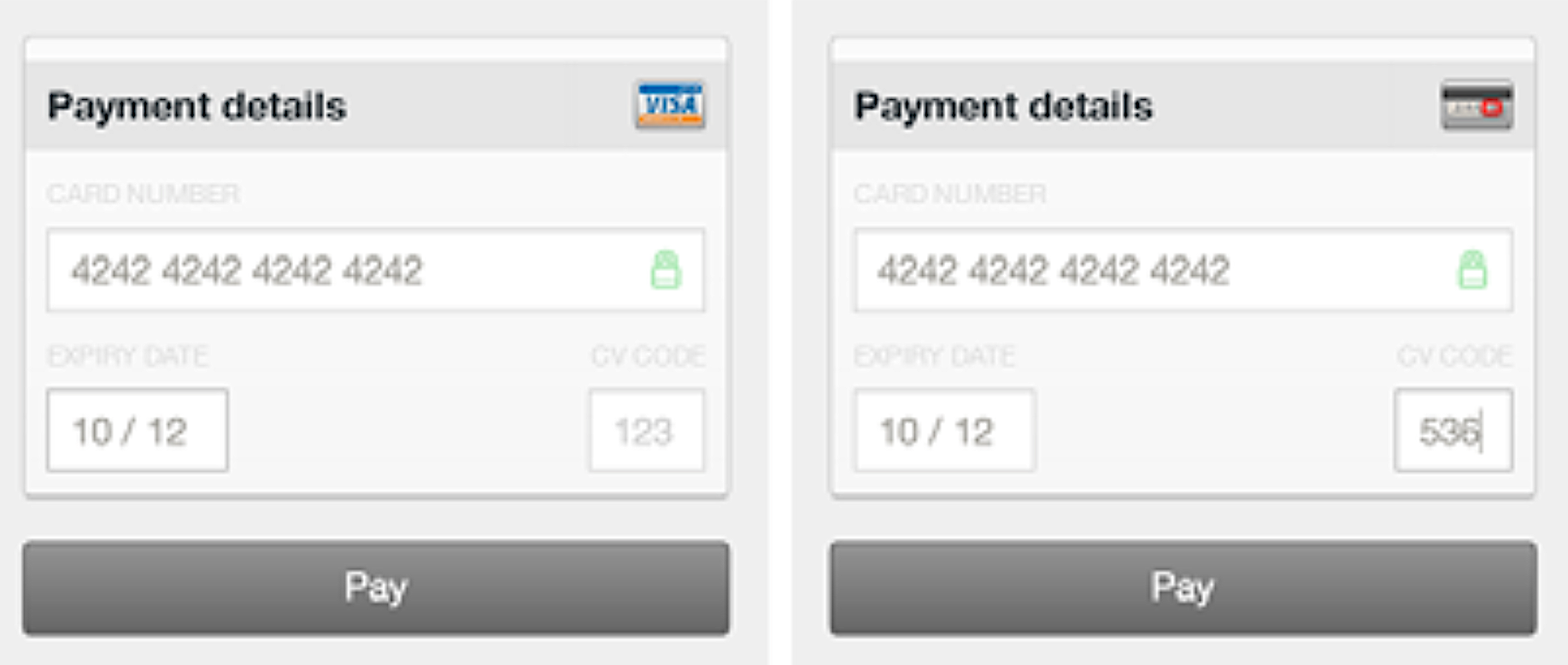
This is a perfect example of attention to detail: it’s helpful, it will delight those who notice, but it was absolutely not necessary. Nobody would have minded or even noticed if this feature had been absent. In a paper, the equivalent would be the extra effort of removing the top and right bar from the frame around your plot, or making sure that the axis labels are in the same typeface as your body text. In a slide deck, it could be making the effort to use a uniform color scheme for all your figures.
If you have a supervisor, they will often steer you away from spending too much time on things like this. To a certain extent, that’s the right thing to do. You can only focus on the details if the big picture is right, and that usually takes up more than enough time. But we should not forget, in our own work or as supervisors, that it’s the details that elevate things.
Giving feedback
There is one more thing in the finishing phase that we can learn from the design world and that is the business of inteligently giving feedback, of critiquing design work. This is not troubleshooting a prototype, but taking something that’s finished, that is the end of a long and arduous journey, and providing feedback on it.
This is a different business than being in the room during the design process. When you’re brought in at the end and you get to see only the final product, you need to be extremely careful about what you do and do not focus on. The designers you are critiquing have been through a process that you’re not aware of. They have been through a hundred blind alleys and juggled a thousand conflicting concerns that you have no idea about. In short, you have to respect their process, and the fact that you’re an outsider to that process.
That doesn’t mean, however, that there is nothing you can say. To illustrate, here is one of my favorite quotes. It’s by Neil Gaiman, and he’s talking about creative writing, but it really applies to any creative pursuit.
Remember: when people tell you something's wrong or doesn't work for them, they are almost always right.
When they tell you exactly what they think is wrong and how to fix it, they are almost always wrong.
—Neil Gaiman
I’ve talked a bit, in the previous section, about how to test rather than ask for feedback. It’s much more important to observe your users using your product than it is to ask them what they think. Making something, designing it, takes skill. The user, more often than not, doesn’t have that skill, and so they will have no idea how to change the thing to make it better. That’s your job.
What they can do, however, is tell you whether it works or not. They’re the user, it’s their experience that counts, and if it sucks, it’s not for you to say it doesn’t. It’s not for them to say how you should improve it, but you do have to improve it.
In an ideal world, this would be the universally understood contract between those giving feedback and those receiving it.
Consider the business of getting reviews. How often have you sent a paper to a journal, received a blistering review, done everything the reviewer asked and still been rejected? It’s because feedback can’t work like this. The reviewer doesn’t have the full picture. They don’t know everything you tried that didn’t work. They don’t have your motivation and your larger research agenda.
If your paper stinks, there is nobody that can give you a step-by-step roadmap for fixing it. You’re the only one that understands the thing well enough to know how to take it apart and put it back together again. The reviewer can only point to parts of it and say that they’re wrong. Maybe, because they’re not entirely unskilled themselves, they can give some hints as to what might work, but ideally, these should always be taken as suggestions, and as secondary to the main point: something is off.
I’m not sure that this would entirely take the sting out of the whole reviewing process. I suspect it’s just one of many problems with the whole business. But it would at least make the contract a more healthy one: the reviewer’s job is to point to potential problems, and the author’s job is to find ways to fix them.
In general, this is good to keep in mind when giving feedback on anything that someone has made, when you weren’t part of making it. You have to respect the author’s process. They own the thing they made, and they made it in a way that made sense to them. If you are brought in at the end, respect that they’ve been through every aspect of its construction back and forth. They are the experts, and they will have struggled with problems that you have no idea about.
Why are we so bad at this?
That’s design thinking. None of this is new. I started learning this stuff twenty years ago, and every designer I talked to when I started teaching it, agreed on these same basic principles I have spelled out above.
So why then, is all of this stuff still so alien to so many scientists? Why do so many of our decisions devolve into in-fighting and slinging back-and-forth of arguments? As I noted before, I suspect it’s partly to do with the fact that science itself is usually structured as an argument. However, I don’t think this naturally forces people to be argumentative beyond the remit of science. Most people I’ve met in academia are naturally conflict-averse, and generally take quite well to more of a design-thinking approach to building things.
I also don’t want it to sound like my work environment is some kind of toxic mess. Everybody I work with is very nice, and even the most solution-focused arguments are always very polite. The issue is more that the habit of design thinking and collaboration is not even on the radar of most people in academia. I suspect many of us have never even considered that our production meetings could benefit from tools and structures.
One part of this problem may be that we’re used to coming up with our own cognitive tools and methods. We’re academics: we’re the ones who come up with the ways in which people think. It’s not an academic instinct to look outside the walls of the university to see how other people solve problems, and what we can learn from them.
Perhaps another, sadder part of the equation is that academia draws in people that are argumentative by nature, and rewards them for it. Certainly, the closer you get to the top of the pyramid, the worse people seem to be at reaching an amicable agreements, and finding synthesis. This could be because the stakes are higher, but it could also be that academia rewards those who are good at arguing their corner, rather than those who collaborate well toward a shared solution.
Again, this isn’t necessarily done in a bad spirit, and these are not bad people. It seems to be just a matter of habit and a lack of reflection on our own methods.
I hope this small window on the life of designers can provide some inspiration. Most of these are tips about how to collaborate. It’s easy enough to sprinkle some design thinking on your own work, but for a collaboration to make effective use of it, all people involved need to understand the idea and apply it effectively. That means we suffer from a network effect: the fewer people think this way, the less useful it’s going to be to those that do.
Still, product design eventually managed to leave behind the dark days of the waterfall methods and solution-focused arguments, and to embrace the various principles of design thinking. Perhaps, in time, academia can catch up.